TV Production Breakthrough: The Canon 5D

January 25, 2012

Just a few years ago, only the big guys could afford to shoot their commercials on 35mm film, while smaller companies had to settle for the harsh, cheap look of video tape.

Not anymore!

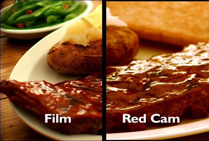
The Canon 5D Mark II Digital Camera evens the playing field by delivering stunning, film-like images for 85% less. This Hi-Definition camera does it all from producing shallow depth of field to delivering rich, realistic scenes under low lighting conditions.  The camera is so amazing, so film-like, that the Director of Photography for the award winning TV show “House” shot the entire 7th season on it!

And with the Canon 5D, you can do a lot more with less. Gone are the days of 15 person crews… lugging lights and equipment from scene-to -scene.  A shot that took almost two hours to light for a film shoot, can now be lit to the same exact standards with a two-person crew in less than 45 minutes!

There’s little doubt that the Canon 5D has brought affordable, high-end TV production to the local advertiser.

Here’s hoping it won’t be wasted on the same low-end concepts?


The Art of Saying it all in a 15-Second Retail TV Commercial (and having it stick)

September 24, 2009

Yes, 15-second TV commercials are a wonderful tool for building media frequency. In fact, I’ve been a big proponent of them for years. And having been involved in the creation of hundreds of them, I can tell you they’re harder than 30s to pull off.

In developing the “creative idea,” focus on scenarios and situations that viewers can understand quickly. If they’re spending the entire commercial trying to “figure things out,” they’re not listening to your advertising message.

Since time is against you, it’s even more important to reinforce your brand along with the message. Consider finding ways to play up your brand’s colors … finding unexpected ways of integrating the logo … or dramatic moments that illustrate your point succinctly.

In short, things that will stick with the viewer long after the commercial has ended. 

Above all, PACE yourself. Make sure the message is clear from the beginning because you won’t have the time to repeat everything. Most 15-second commercials feel like 30s that were crammed into half the time. If your pace is too quick, all will be lost.

Below are 3 examples, each using a different technique. All are unique in their own way. Yet all establish the premise immediately and pace themselves carefully.

In this commercial for one of our financial services clients, we used the entire span of 15 seconds to take the viewer on a visual journey ending up at an unexpected visual element that reinforces the client’s brand.


Here, multiple cuts and scenes make this 15-second spot seem longer than 15 seconds. At the end, the brand is represented by its people.


In this more recent commercial for the same client, the actor delivers lines directly to camera in a simple monologue format –  while the “visual surprise” reveals itself in the window behind her.


Share


How a Splurge Can Give Your Retail TV Commercial Serious Creative Firepower

September 22, 2009

I’ll begin by stating the obvious: not everybody has the ad budget of a Fortune 500 company. But that doesn’t mean your creative can’t compete on a national level. You just have to make your production money work harder. 

Should you opt for an animated logo treatment? Custom music track? Film instead of video? A big name talent? You DON’T have to use them all to give your commercial serious creative firepower. They key is knowing what to splurge on.

By spending your money on one or two pricier components, the rest of your commercial production is elevated to a new level. Here are some examples where one or two splurges gave the TV creative national-caliber impact without a national-caliber budget.  

Here, the storefront footage already existed. All we did was resize it and add quotation marks, which was VERY inexpensive. However, we needed a special voice over talent to bring the commercial to life. We opted for Tom Sharpe, for his widely recognized voice and unique style of humor. He was the only expensive component (10 times the cost of your average voice over talent) but well worth the expense. 


Here, the custom music track and the animated logo treatment were the most expensive items (about $7,000 combined). However, these elements were used again and again in future commercials keeping long-term production costs down while keeping production values up.


Share


Using Retail TV Graphics Successfully: 5 Tips to Consider

September 18, 2009

Graphics are a great way of supporting your advertising message. But if they’re not handled carefully, they’ll hurt the clarity of your commercial rather than enhancing it. Here are a few things to consider when adding prices, offers and logos:

1) Consider Letterbox.

Traditional Letterbox (see example below) places your commercial between two black bands, much like the format of your favorite DVD when you watch it widescreen. This usually requires planning before the TV shoot so the picture is condensed to fit the Letterbox size.

This format is wonderful for showing detail within a scene (because you’re condensing the picture), but it’s also a GREAT tool for placing graphics. Addresses, logos and phone numbers work beautifully when placed in a Letterbox format, keeping such elements from dominating your footage.

2) Restrict your color palette.

Be careful you don’t use all the colors of the rainbow when creating your “supers” (another word for on-screen graphics). It’s good to have some color variation (usually two colors) to compartmentalize the information so it’s read easily. Too many colors confuses the eye and detracts from the footage within the commercial.

3) Place your graphics consistently.

Don’t confuse the viewer by jumping all around the screen. Place graphics so that they enhance the message and don’t distract from it.  If you have a series of graphic elements, consider keeping them in the same placement.

4) Consider instances where the graphics may be more important than the footage.

If the footage is more or less the same throughout (i.e. rows of used cars or a showroom of random pieces of furniture), there may be an opportunity to let the graphics play a more dominant role within the message. In cases like this when large prices may cover most of the screen, try defocusing your background to enhance readability.

5) Introduce type elements in an interesting way.

If the pace of your retail commercial is “urgent,” consider introducing your type onscreen using motion. Your TV editor can offer a variety of ways to do so. This little trick spices things up, giving the price/super a life of its own.

And now for my disclaimer: The key to using the list above is knowing what’s appropriate for your audience and making choices with great care. A used car commercial and a financial services commercial targeting seniors are two different animals. In one, moving type and interesting visual tricks can add excitement. In the other, unrestrained stylistic choices can cheapen the message and appear distasteful. Determine the right tone for your commercial, and let it be your guide.

Here’s a commercial for a local car dealer that demonstrates all of the above.  

Share


TV Production Terms: Everything You Wanted to Know But Were Afraid to Ask.

September 15, 2009

Picture for Post #23Hang around on set during a TV production and you’ll likely scratch your head once or twice wondering what a “Best Boy” is. In TV, there are lots of unusual names for the people and things behind the scenes of each commercial being brought to life.

Having been on set hundreds of times, I often hear the same questions again and again from clients who are also attending the shoot. 

I’ve compiled a list of terms here:

DP: Director of Photography

AC: Assistant Camera

AD: Assistant Director / PA: Production Assistant

Gaffer: The chief lighting technician for a production who is in charge of the electrical department.

Key Grip: The chief grip who works directly with the gaffer in creating shadow effects for set lighting and who supervises camera cranes, dollies and other platforms or supporting structures according to the requirements of the director of photography.

Best Boy: The assistant chief lighting technician or the assistant to the key grip.

Slate: The identifier placed in front of the camera at beginning of a take.

Key Light: The main light on a subject. (Lighting)

Dolly Shot: Any shot made from a moving dolly. These may also be called tracking or traveling shots.

Pan: A horizontal movement of a camera on a fixed axis.

Gate: The aperture assembly at which the film is exposed in a camera, printer, or projector. This should always be checked before moving on to a new shot to make sure no hairs or dust particles got inside the camera. These things can ruin a shot.

Apple Box: A box built of a strong wood or plywood, which is capable of supporting weight. These may be of various sizes, the smallest of which is also known as a ‘pancake’ because it is nearly flat. (Lighting/Grip)

Rough cut: A preliminary trial stage in the process of editing a film. Shots are laid out in approximate relationship to an end product without detailed attention to the individual cutting points.

Food Stylist: An artist who works on set to perfect the look of food being shot.  This is a specialist, who concentrates on food preparation and presentation.

MOS: A term in TV commercials when you’re shooting subjects but not recording sound.

VO: Voice Over. The narrative voice you hear in TV spots.

Super: Refers to type on screen that supports a sales offer.

There you have it. Memorize these and you’ll impress everyone on set next time. Again, these are some of the most commonly terms used. If you’d like to learn oodles more – and by oodles I mean hundreds – click here: Filmland

Share


Giving Retail TV Commercials the “Film” Look Without the Film

September 14, 2009

Companies who want their TV commercials to look national often hone in on the “look.” And the biggest commonality among commercials produced by major brands comes down to a four-letter word: FILM.

Major advertisers overwhelmingly choose film for their commercials for all kinds of reasons. Ask the country’s top commercial film directors and they’ll go on and on. Film has warmth. Film makes ideas seem more credible. Film makes a commercial seem more important to the viewer. Film provides a glow and softness that makes the viewer forget that there’s a camera and crew in the room.

Problem is, not everybody can afford to shoot on 35 mm film or even 16 mm film. Fortunately, there are viable options that didn’t exist a few years ago.

First up is the Veracam, a video camera that simulates the look of film. This one has been around and works beautifully.

Another option is the “Red” – one of the newest cameras on the market. This camera is entirely digital and simulates the look of film. And many say it’s the best at doing so. 

The Red also comes with another plus. Because it shoots everything digitally – and at a VERY high degree of quality – the images can be used in print applications like ads and brochures. (Do that with film and everything’s fuzzy.)

In both the Veracam and the Red, there is no film stock to buy…and no expensive telecine lab needed for color correcting. However, final shots selected for your commercial will still need color correction, which can be done easily by the editor or the director.

Without getting too mired in technical data, why not judge for yourself.  Can you tell which was shot on film and which was shot digitally (Red Camera)?  If you can’t … do you think you customers will?  

Picture for Post #22

Share